Funnel report
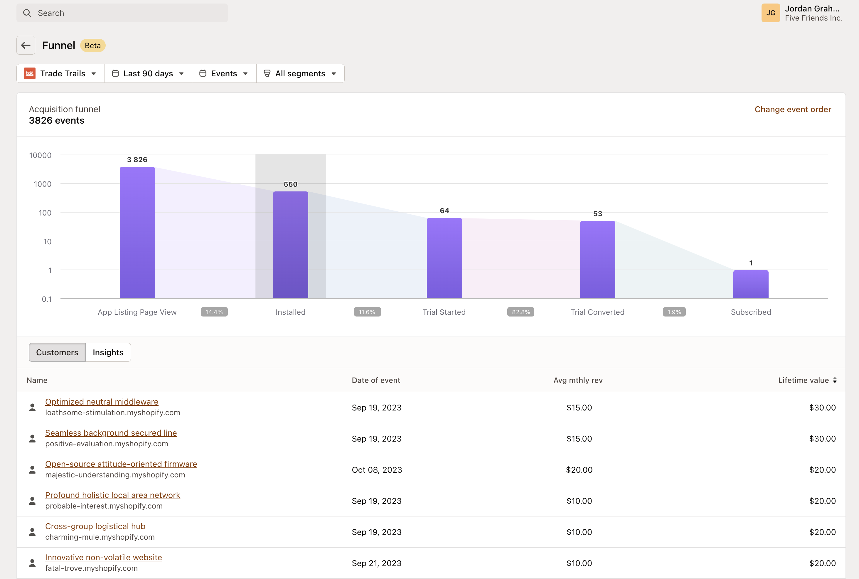
Mantle’s funnel report visualizes the acquisition funnel from initial interest to conversion, helping you analyze customer interactions over time. The funnel consists of the following events:
Funnel events:
| Event | Description |
|---|---|
| App listing page view | Customer viewed your app listing. |
| Add app | Customers who click the “Add app” button on the listing page, indicating intent to install. |
| Installed | Customers who have installed your app. |
| Uninstalled | Customers who have removed the app from their store. |
| Reinstalled | Customers who have installed the app again after previously uninstalling it. |
| Trial started | Customers who have begun a trial period, indicating deeper engagement. |
| Trial converted | Customers who have transitioned from a trial to a subscription, marking successful acquisition. |
| Subscribed | Customers who have an active subscription, which may be paid or on a free plan. |
| Unsubscribed | Customers who have cancelled their subscription. |
| Resubscribed | Customers who have reactivated their subscription after previously cancelling. |
| Upgraded | Customers who have moved to a higher-tier subscription plan. |
| Downgraded | Customers who have moved to a lower-tier subscription plan. |
| Subscription frozen | Subscriptions that have been temporarily paused. |
| Subscription unfrozen | Subscriptions that have been reactivated after being frozen. |
| First transaction | The initial payment made by a customer, marking the start of their paid relationship with the app. |
| One-time charge | Customers who have made a single, non-recurring payment. |
| Charge abandoned | Instances where a payment attempt was unsuccessful or abandoned. |
Each event provides insights into customer behavior and helps identify potential areas for improvement in your customer acquisition, retention, and monetization processes.
Table overview:
Below the funnel, a detailed table provides a granular view of each event. This includes:
-
Name: The store or customer name associated with the event.
-
Date of event: When the specific event (like installation or trial start) occurred.
-
Average monthly revenue: An estimate of the monthly revenue generated by each customer.
-
Lifetime value: The total revenue a customer is expected to generate over their lifetime as a customer.
Usage:
Use this funnel report to identify drop-off points and optimize each stage of the acquisition process. Analyze conversion rates and event occurrences to improve customer experience, acquisition, retention, monetization, and marketing strategies.
Insights
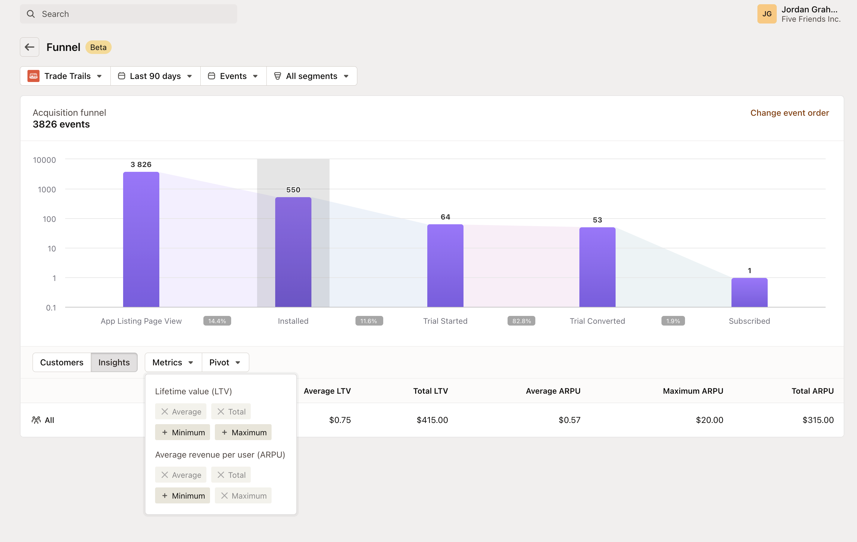
The funnel chart includes a dynamic insights feature that allows customization of the data table with key metrics like Lifetime Value (LTV) and Average Revenue Per Customer (ARPU). These insights help you:
-
Measure LTV: Assess the average and total Lifetime Value of customers to understand long-term profitability.
-
Understand ARPU: Determine the Average Revenue Per Customer, both the highest value (Maximum ARPU) and the collective average, to gauge revenue trends and per-customer value.
This enriched data view aids in segmenting customer cohorts and identifying patterns that can inform strategic decisions, optimize marketing efforts, and ultimately drive growth.
Pivot table
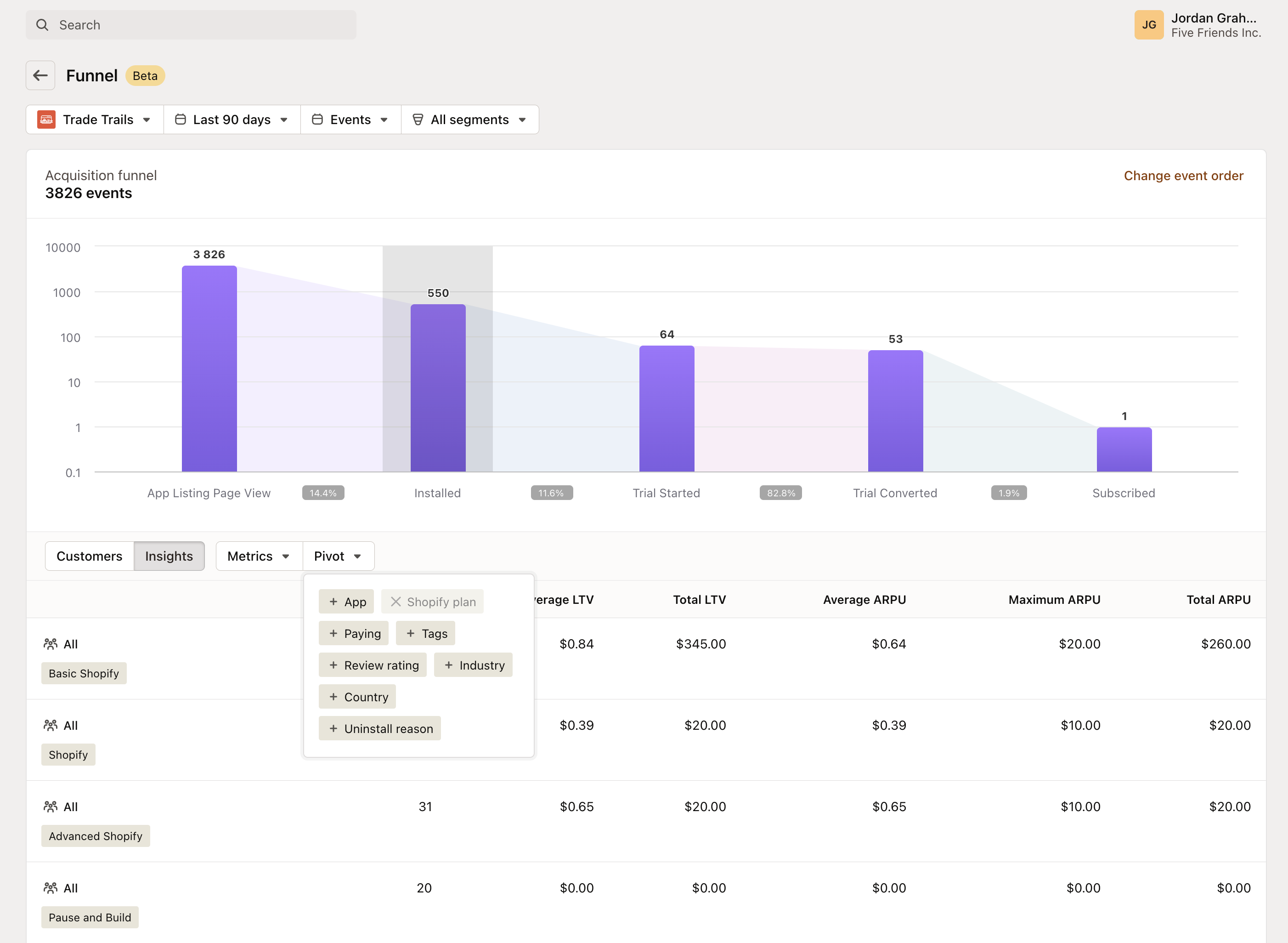
The pivot table feature enables you to cross-reference various data points against key performance indicators, providing multidimensional views of your funnel metrics.
Customizing with Pivot Tables:
-
Segmentation: Break down metrics by specific categories like app type, customer plan, or other attributes to pinpoint trends and patterns.
-
Comparison: Compare different segments side-by-side to evaluate performance across various customer groups.
-
Detailing: Drill down into data with finer granularity, such as by country or reason for uninstalling, offering a detailed lens on customer behavior.
By integrating pivot tables into your funnel analysis, you can unlock a comprehensive understanding of how different segments interact with your app, leading to informed decision-making for targeted marketing strategies and product improvements.